A product can have a beautiful logo and still frustrate its users. Another can work perfectly and still feel forgettable. The strongest products avoid both traps because their makers treat brand identity and user experience as one conversation, not two separate jobs.
What brand identity really is
Brand identity is more than a logo and a color palette. It is the set of choices that tell people who you are: your voice, your visual style, your values and the promises you make. It shows up in packaging, websites, emails and support replies.
A clear identity helps people recognize you in a crowded market and trust you when they have not yet used what you sell.
Identity is a promise, and experience is where that promise is kept or broken.
What UX design adds
User experience design focuses on how a product works for real people. It asks whether users can find what they need, understand what to do next and recover when something goes wrong. Good UX removes friction, saves time and builds confidence.
UX work begins with research. Designers talk to users, watch them attempt tasks and study where they hesitate. Those insights shape structure, flows and interface details long before anyone chooses a button color.
Where the two disciplines meet
Every interaction is a small piece of branding. A friendly error message, a smooth checkout and a thoughtful empty state all express personality. A confusing form or a cold, robotic tone does the opposite, whatever the logo looks like.
When identity and UX are aligned, users sense coherence. The look matches the language, the language matches the behavior, and the whole product feels like it was made by one mind.
Building a shared foundation
Start with a short brand brief. Define the audience, the tone of voice, the core values and three or four words that describe the feeling you want. Share it with everyone who touches the product, from designers to engineers to support staff.
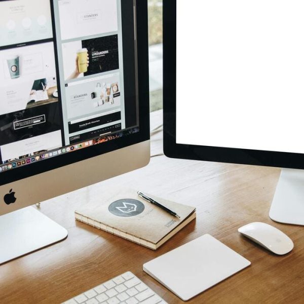
Then translate it into a design system. A good system includes typography, color, spacing, icons, components and writing guidelines. It turns abstract values into reusable parts that keep the product consistent as it grows.
Color, type and layout with purpose
Every visual choice should serve both beauty and clarity. Color can signal action, warning or success, but it must also meet accessibility standards so that people with low vision can read it. Type should have a clear hierarchy, with sizes and weights that guide the eye.
Layout creates rhythm. Generous white space gives content room to breathe, while a consistent grid helps users predict where things will be. The best designs often look simple because many hard decisions have been made quietly.
Testing early and often
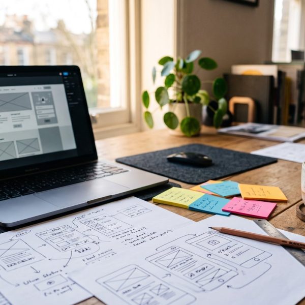
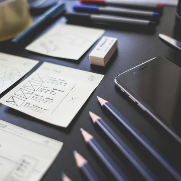
Do not wait for a finished product to find problems. Sketch ideas, build rough prototypes and put them in front of five or six users. Watching real people struggle is the fastest way to learn what to fix.
The research group Nielsen Norman Group publishes practical guidance on usability testing, heuristics and interface patterns, and it is a trusted reference for design teams of all sizes.
Designing for accessibility
Accessible design is good design. Provide enough contrast, label every control, support keyboard navigation and avoid relying on color alone to convey meaning. These steps help people with disabilities and also improve the experience for everyone, from a user in bright sunlight to a parent holding a baby.
Make accessibility part of the brand promise rather than an afterthought. It signals respect and widens your audience.
Taking a product across markets
When a product enters a new country, identity and UX face a new test. Words change length, reading direction can flip, and gestures and colors carry different meanings. A button label that fits in English may overflow in German, and a joke in one language may fall flat in another.
Planning for this early saves time and money. Leave room in layouts for longer text, avoid embedding words inside images and write copy that is easy to translate. Professional business translation services help keep the voice of the brand intact so that users abroad feel the same personality as users at home.
Teams that ship often need tools as well as translators. This look at a translation management system built for localization teams shows how design and language work can move through one shared process.
Measuring what matters
Design is only worthwhile if it improves outcomes. Track task completion rates, time on task, support tickets, conversion and customer satisfaction. Pair these numbers with interviews, since data shows what happens and conversation explains why.
Review the results with the whole team. When designers, writers and engineers see the same evidence, decisions get faster and less political.
Common mistakes to avoid
The first is treating brand as decoration applied at the end. The second is copying trends without asking whether they suit your users. The third is changing everything at once, which confuses loyal customers. Evolve in steps and explain changes clearly.
Finally, avoid designing in isolation. The best products come from teams that listen to users, to each other and to the world beyond their screens.
A practical starting point
If you are early in a project, begin with a one page brand brief and a small set of core components. Test with real users, fix the biggest problems and expand step by step. Consistency and care will do more for your product than any single dramatic redesign.
When brand identity and UX design share one purpose, products look right, feel clear and earn lasting trust.